What font does Snapchat use is a common question because Snapchat’s text looks simple, playful, and instantly recognizable. The short answer is that Snapchat currently uses a custom typeface known as Snapchat Sans, while older versions and related brand materials have often been linked to fonts like Avenir, Avenir Next, Helvetica, and Helvetica Neue. If you want to recreate the Snapchat look for social posts, thumbnails, captions, mockups, or brand graphics, you need to understand both the official font style and the closest practical alternatives.
Snapchat’s typography works because it does not try too hard. It feels clean on a small screen, stays readable over photos and videos, and gives users enough personality without making every Snap look crowded. This guide explains the font, its history, similar fonts, design use cases, and the easiest way to create Snapchat-style text outside the app.
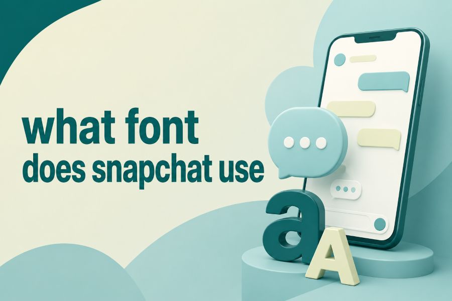
What Font Does Snapchat Use Today?
Snapchat’s current signature typeface is widely understood to be Snapchat Sans, a custom font created to match the app’s fast, visual, mobile-first experience. It is a clean sans-serif typeface with friendly spacing, simple letterforms, and a modern shape that keeps messages easy to read even when they appear over busy photos, videos, stickers, filters, and moving backgrounds.
The reason many people still mention Avenir, Avenir Next, Helvetica, or Helvetica Neue is that Snapchat’s older interface and visual style shared qualities with those fonts. Avenir has a polished geometric feel, Helvetica has a neutral digital look, and Avenir Next offers strong screen readability, so all three can feel close to Snapchat’s older design language. Snapchat Sans, however, gives the brand a more owned and consistent identity.
You can think of Snapchat Sans as the app’s quiet design engine. It does not steal attention from the Snap, but it gives captions, menus, names, labels, and interface text a familiar tone. When you need to create stylized captions outside the app, a font generator for stylish text and creative fonts can help you test decorative text ideas, while Snapchat-style design still works best when the final font remains readable and not overly complex.
Why Snapchat’s Font Feels So Recognizable
Snapchat’s font feels recognizable because it matches the way people use the app. Users open Snapchat quickly, send photos quickly, add captions quickly, and expect the text to make sense at a glance. That is why the font needs to look casual without becoming messy, and readable without feeling too formal.
The famous Snapchat caption bar also plays a huge role. The classic style uses white text inside a semi-transparent gray or dark overlay, which makes the words stand out against almost any image. This text treatment became part of Snapchat’s visual identity because it solved a real design problem: photos are unpredictable, so captions need a consistent background.
Snapchat’s text also feels familiar because it is not designed like a newspaper, academic document, or corporate report. It has a lightweight, social-first personality that supports jokes, updates, reactions, reminders, and quick storytelling. The font works because it disappears when it should and adds personality when users switch to larger, colorful, or decorative caption styles.
Snapchat Sans Versus Avenir And Helvetica
Snapchat Sans, Avenir, and Helvetica all belong to the broader sans-serif family, but they do not create the exact same feeling. Helvetica is more neutral and classic, Avenir is more geometric and elegant, while Snapchat Sans feels more tailored to a youthful social app. This difference matters when you are trying to recreate Snapchat-style designs for content or branding.
Avenir is often considered one of the closest premium matches because it has clean shapes, smooth curves, and strong readability. Helvetica Neue can also work when you want a more minimal interface look, especially for app mockups, menus, or understated captions. Still, neither one perfectly replaces Snapchat Sans because Snapchat’s custom font was built around its own product experience.
If you create social content, your font choice should match the job of the design instead of copying Snapchat blindly. A brand voice can become clearer when you understand how AI assist creators and the same principle applies to typography because every font should support the message, audience, and platform. Choose Avenir for a polished Snapchat-like feel, Helvetica Neue for a cleaner tech look, and Public Sans when you need a free alternative.
Best Free Alternatives To Snapchat’s Font
The best free alternative to Snapchat Sans is usually Public Sans because it is clean, flexible, and easy to use in web and design projects. It does not copy Snapchat Sans exactly, but it gives you a similar readable, modern, and friendly structure. For most creators, that is enough to build Snapchat-inspired captions, thumbnails, social graphics, and mockups.
Arimo is another useful option because it has a simple screen-friendly appearance. It can work well for captions, interface samples, and clean mobile-style layouts. If you want a slightly softer or more playful look, Fredoka can help you create friendlier designs, although it feels less like Snapchat’s default interface font and more like a casual display font.
Decorative fonts can also imitate the personality of Snapchat’s in-app font choices. Comic Neue can create a casual handwritten mood, Bangers can bring comic-style energy, Pixelify Sans can give a retro digital feel, and Bad Script can create a loose handwritten effect. Creative tools become more useful when you understand how content generators work and font choices work the same way because the best result comes from using the right style for the right context.
How Snapchat Text Works Inside The App
Snapchat text is designed for speed. After taking or uploading a Snap, you tap the screen or text icon, type your message, and then choose from available text styles above the keyboard. Depending on your app version and device, the font order and available styles may look slightly different.
The default caption style usually appears as white text on a translucent bar. This is useful for short captions because it keeps the words visible without covering the entire photo. However, that default caption bar is limited because it does not behave like fully flexible design text.
When you switch to free-floating text, you get more control. You can resize the text with two fingers, drag it around the screen, rotate it, change its color, and make it feel more expressive. This is why Snapchat’s typography is not only about one font; it is also about movement, placement, contrast, and quick creative control.
Why Readability Matters In Snapchat Font Design
Readability is the biggest reason Snapchat’s font choices work. Snaps are often viewed quickly, sometimes for only a few seconds, so users should not struggle to read the caption. A decorative font may look fun, but if it slows the reader down, it weakens the message.
Snapchat also has to handle messy backgrounds. One Snap may show a bright beach, another may show a dark concert, and another may show a cluttered bedroom. A simple sans-serif typeface gives text a better chance of staying readable across all those visual conditions.
This is also why the gray caption bar became so useful. It adds contrast without making users manually design a background every time. If you are recreating Snapchat text outside the app, contrast should be your first concern, especially when placing white or light text over photos.
Readability Tips For Snapchat-Style Text
Use short captions when the image is busy. Keep important words away from faces, product details, or bright areas. Add a translucent background or shadow when the photo makes the text harder to read.
How To Recreate Snapchat-Style Text Outside Snapchat
To recreate Snapchat-style text outside the app, start with a clean sans-serif font. Public Sans, Avenir, Avenir Next, Helvetica Neue, or Arimo are good choices depending on your budget and design tool. The goal is not to make an exact clone, but to capture the same clean, mobile-friendly mood.
Next, use white text over a semi-transparent dark rectangle if you want the classic caption-bar effect. Keep the caption short, center it naturally, and avoid making the bar too tall. The design should look like a quick social caption, not a large banner ad.
For a more modern Snap-like style, use larger free-floating text. Add bold weight, bright colors, outlines, or slight rotation when the design needs energy. Just keep the message readable because Snapchat-style text works best when it feels spontaneous but still easy to understand.
Snapchat Font Options For Different Moods
Snapchat’s in-app fonts help users match text to emotion. A plain sans-serif caption works for everyday updates, while a bolder font can make a joke, announcement, or reaction feel louder. A handwritten-style font can make a Snap feel personal, relaxed, or informal.
For party photos, bold and playful fonts usually fit better than formal typefaces. For memories, birthdays, or emotional posts, softer script-inspired fonts can feel warmer. For quick updates or simple explanations, the classic sans-serif look is still the safest option.
The key is to match the font to the message. If the text says something funny, let the font support the humor. If the Snap is informational, choose clarity first. Snapchat’s strength is that it gives you enough freedom to make text expressive without requiring advanced design skills.
Common Mistakes When Copying Snapchat Typography
One common mistake is using fonts that are too decorative. A font may look exciting in a preview, but it can become unreadable over a real image. Snapchat-style text should feel fun, but it should never make the reader work too hard.
Another mistake is placing text over the busiest part of the photo. Even the cleanest font can fail when it sits on top of bright lights, patterned clothing, or detailed backgrounds. You should always check whether the text is clear at phone-screen size.
A third mistake is using too much text. Snapchat is built for short, fast messages, so long paragraphs rarely feel natural inside a Snap-style design. If you need more explanation, break the message into multiple screens or use a cleaner layout outside the Snapchat format.
Is Snapchat Sans Available To Download?
Snapchat Sans is a proprietary brand typeface, so it is not normally available as a public download for general use. That means you should avoid hunting for unofficial files because they may be inaccurate, unsafe, or legally questionable. The better approach is to use a similar licensed or free font.
Public Sans is the most practical free choice for many projects. It is readable, modern, and easy to use in websites, graphics, and social content. Avenir and Avenir Next are stronger premium options when you want a closer polished feel.
If you are designing for a brand, always choose fonts you have permission to use. Typography is part of visual identity, and using the wrong font file can create licensing issues. A similar-looking legal font is better than an unofficial copy of Snapchat Sans.
Snapchat Font In Branding And Content Design
Snapchat’s font choices show how typography can shape brand personality. The app does not rely only on its ghost logo or yellow color; it also uses clean text to create a consistent user experience. Every caption, label, and interface element helps reinforce the brand’s fast and playful identity.
This is useful for your own content or business design. If your audience is young, mobile-first, and social, you may want a font that feels friendly, quick, and informal. If your audience expects professionalism, you may need something more restrained even if you like Snapchat’s style.
Good typography is not about choosing a popular font because everyone else uses it. It is about choosing a font that matches your message and keeps the reader engaged. Snapchat succeeds because its typography fits the product instead of fighting against it.
Quick Font Pairing Ideas For Snapchat-Like Designs
For a clean Snapchat-inspired layout, pair Public Sans with a bold display font. Public Sans can handle captions and smaller details, while a stronger display font can highlight one or two important words. This keeps the design readable while still giving it personality.
For a fun social graphic, pair Avenir or Arimo with Bangers, Fredoka, or Comic Neue. Use the playful font only for emphasis, not for every line. This prevents the design from becoming noisy.
For a more polished brand mockup, use Avenir Next with a simple neutral font family. Keep the spacing generous, the colors clear, and the text short. The result will feel modern and social without looking like a direct Snapchat copy.
Conclusion
what font does Snapchat use is best answered by saying Snapchat uses Snapchat Sans today, while Avenir, Avenir Next, Helvetica, and Helvetica Neue remain important references for older or similar Snapchat-style typography. If you want the closest practical result, use Public Sans for a free option, Avenir or Avenir Next for a premium feel, and a translucent caption bar for the classic Snap look.
The real lesson is that Snapchat’s typography works because it supports fast communication. It stays readable, feels casual, and gives users room to express emotion without overwhelming the image. When you recreate the style, focus on clarity first, then add personality through size, color, placement, and contrast. That approach will help your Snapchat-inspired designs look modern, useful, and natural.