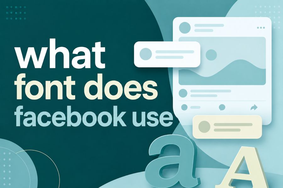
What font does Facebook use is a common question because the platform’s typography looks simple, familiar, and carefully balanced across every device.
The short answer is that Facebook does not rely on only one font for everything, because its logo, app interface, marketing materials, and brand system use different typography choices for different jobs. Once you understand the difference between Facebook’s logo font, system fonts, and branded typefaces, you can copy the right design logic without copying the brand itself. Read for more information.
What Font Does Facebook Use In Its Logo?
The Facebook logo is strongly associated with Klavika Bold, the geometric sans-serif font used in the company’s earlier wordmark. That old logo had a confident, compact, square-edged look that helped Facebook feel modern, technical, and recognizable during its early growth years. Today, the current Facebook wordmark is better described as custom lettering inspired by that history, not a downloadable public font you can simply install and use.
This distinction matters because many people search for a single “Facebook font” and expect one exact answer. If you want to test similar letter styles for creative projects, a font generator for stylish text and creative fonts can help you compare decorative text ideas, but Facebook’s official logo lettering remains a controlled brand asset. The safest takeaway is that Klavika Bold is a close historical reference, while the modern wordmark is a custom brand design.
Why Facebook Does Not Use One Single Font Everywhere
Facebook’s typography works because it separates brand identity from daily usability. The logo needs to be distinctive, but the feed, comments, buttons, menus, notifications, and settings need to feel native on your device. That is why the app experience often depends on system fonts rather than one universal font forced across every platform.
On iPhones and Macs, Facebook can appear with Apple’s San Francisco family, while Android users commonly see Roboto. Windows users may see Segoe UI, and web users may see a font stack that falls back through system-ui, Helvetica, Arial, and sans-serif options. This approach makes Facebook feel fast, readable, and familiar instead of heavy or visually disconnected from the device you already use.
Facebook Sans And The Brand Typography System
Facebook Sans is usually discussed as the brand-focused typeface connected with Facebook’s more recent identity work. It is clean, friendly, geometric, and designed to support headlines, campaigns, marketing pages, presentations, and other controlled brand environments. It is not the same thing as the everyday font you see in every comment, post, or menu inside the main app.
This is similar to how content tools separate output style from interface usability. A writer studying how AI helps with content creation learns that the process works best when structure, clarity, and purpose guide the final message. Facebook applies a similar principle visually by using brand typography where identity matters and system typography where speed and comfort matter most.
What Font Does Facebook Use In The App And Website?
What font does Facebook use inside the app depends on the operating system, because Facebook wants the interface to feel natural on every screen. On iOS, the experience commonly follows Apple’s San Francisco style, while Android relies heavily on Roboto because that is the native Android interface font. On desktop and web environments, Facebook often uses system font stacks that can include Segoe UI, Helvetica, Arial, and generic sans-serif fallbacks.
This type of font strategy keeps the interface practical instead of decorative. Designers who study AI writing assistant and how is it beneficial can see how tools become useful when they reduce friction and help people complete tasks faster. Facebook’s UI fonts follow that same idea by staying invisible enough to let users focus on posts, messages, buttons, and actions.
The Difference Between Klavika Bold And The Current Facebook Wordmark
Klavika Bold is an important part of Facebook’s design history, but it is not a perfect match for the current logo. The older Facebook wordmark had sharper, more technical letterforms, while the newer logo feels softer, more rounded, and more approachable. One major visible difference often discussed is the lowercase “a,” because the modern wordmark moved toward a simpler single-story style.
This change is more than cosmetic. It reflects Facebook’s movement from a young tech network into a global communication platform used by billions of people across age groups, cultures, and devices. A softer wordmark can feel more accessible, less rigid, and easier to recognize at small sizes on mobile screens.
Facebook Font Colors And Visual Identity
Typography is only one part of Facebook’s visual identity, because the color palette carries a huge amount of brand recognition. The modern Facebook blue is commonly represented as #1877F2, a brighter and more energetic blue than the older classic blue many people remember. The older shade, often associated with #3b5998, still appears in design discussions because it defined Facebook’s early identity for years.
The newer blue works better in modern digital environments because it has stronger contrast and a fresher feel on mobile screens. Facebook also uses supporting colors such as white, light gray, darker gray, and neutral interface shades to make the blue stand out without overwhelming the user. The result is a clean system where typography, spacing, and color all support recognition and usability.
Why Facebook Uses System Fonts For Readability
System fonts are built for the devices people already use, so they usually load quickly and display clearly. Facebook benefits from this because every extra delay, visual glitch, or readability problem can affect how people interact with feeds, ads, groups, comments, and messages. A system-font strategy also reduces the risk of inconsistent rendering across screen sizes and browsers.
Readability is especially important on Facebook because the platform contains many types of content in one place. You may see a long status update, a short comment, a marketplace listing, a group rule, a notification, and an ad within the same session. Using familiar fonts helps your eyes move through that mixed content without feeling like every section belongs to a different product.
Can You Download The Facebook Font?
You cannot officially download the current Facebook logo font as a normal public font. The modern wordmark is a custom brand asset, and using it too closely in your own project can create legal, branding, or trust problems. If you are designing something inspired by social media typography, it is better to study the principles rather than imitate the logo.
For general UI design, you can use clean sans-serif fonts such as Roboto, Inter, Arial, Helvetica, or system-ui stacks. For logo inspiration, you can look for geometric sans-serif typefaces with balanced spacing, rounded confidence, and strong lowercase shapes. The goal should be to create something clear and memorable, not something that could be mistaken for Facebook.
Best Facebook Font Alternatives For Designers
If you want a Facebook-like feel without copying Facebook, focus on clean, readable sans-serif fonts. Roboto works well for Android-style interfaces, San Francisco-inspired choices work well for Apple-style mockups, and Inter is a strong modern option for web dashboards and SaaS layouts. Helvetica, Arial, and Segoe UI can also create a familiar, neutral interface when used with careful spacing.
For logo work, choose fonts that feel geometric but not cold. Look for rounded curves, strong lowercase letters, clear counters, and balanced weight, because these features help a brand feel both digital and human. Avoid overusing novelty fonts, because Facebook’s design power comes from restraint, consistency, and repetition rather than visual noise.
How Facebook Typography Supports User Trust
Facebook’s typography is not flashy, and that is part of the point. A social platform has to make users feel comfortable reading private messages, public posts, business pages, community discussions, and ads. If the typography looked too experimental, people might notice the design more than the content, which would weaken the platform’s core experience.
Trust also comes from consistency. When buttons, labels, comments, names, timestamps, and settings follow a predictable visual system, users understand where to click and what each element means. This is why Facebook’s font choices are mostly practical, because good interface typography should guide behavior without constantly asking for attention.
What Designers Can Learn From Facebook’s Font Strategy
The biggest lesson is that brand fonts and product fonts do not always need to be the same. Your logo can have a custom, distinctive personality, while your app or website can use system fonts for performance and readability. That separation gives you more control because each font choice serves a clear purpose.
You can also learn the value of restraint from Facebook’s design system. Instead of mixing many font families, Facebook relies on hierarchy, weight, color, spacing, and size to create order. This keeps the interface simple, which is important when your content changes every second and users need to understand it instantly.
Common Mistakes People Make About Facebook Fonts
The most common mistake is saying Facebook uses Klavika Bold for everything. Klavika Bold is historically important for the old logo, but it does not explain the full app experience, modern wordmark, or brand system. A more accurate answer separates the logo, interface, and marketing typography into different categories.
Another mistake is assuming that a similar font gives you permission to copy the Facebook style directly. Brand identity includes more than letter shapes, because it also includes color, spacing, layout, iconography, tone, and user expectations. If you want a professional result, borrow the design lesson of clarity, but build your own recognizable visual voice.
Quick Answer: What Font Should You Use For A Facebook Style Design?
For a Facebook-style interface, use a clean system-font stack such as system-ui, Segoe UI, Roboto, Helvetica, Arial, and sans-serif. This gives your layout a native, lightweight, readable feel across devices without depending on a single custom typeface. For Android-first designs, Roboto is a strong choice, while Apple-focused mockups can lean toward San Francisco-style typography.
For a logo or headline inspired by Facebook’s older identity, look for geometric sans-serif fonts with firm structure and friendly curves. Do not chase an exact duplicate, because the current Facebook wordmark is custom and brand-protected. Instead, focus on the deeper formula: simple letterforms, strong recognition, mobile readability, and a color system that supports the message.
Conclusion
What font does Facebook use is best answered by looking at the full brand system, not just the famous logo. The old Facebook logo is linked to Klavika Bold, the current wordmark is custom, the app relies on system fonts like San Francisco, Roboto, Segoe UI, Helvetica, and Arial, and Facebook Sans supports broader brand communication.
If you are designing your own project, the smartest move is not to copy Facebook’s typography exactly, but to copy the thinking behind it: use a distinctive logo style, readable interface fonts, consistent spacing, and a clear color palette that helps people recognize and trust your brand.